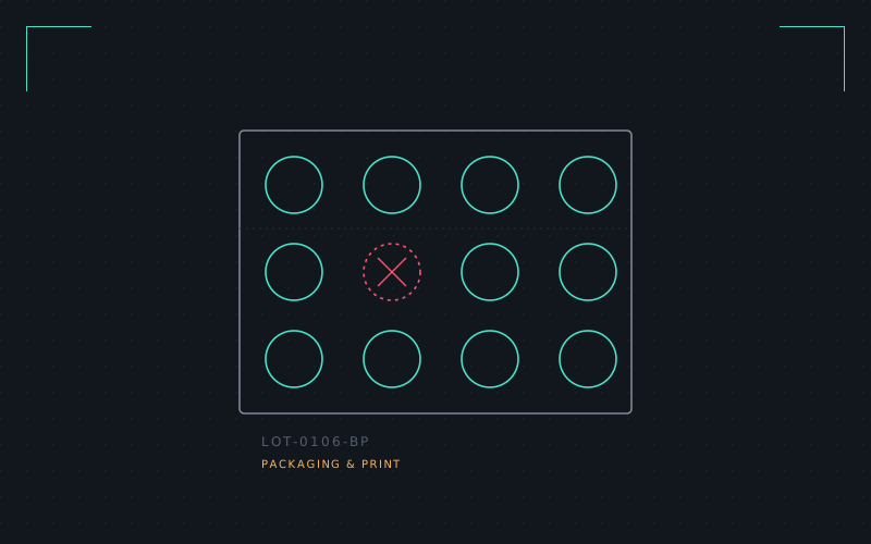
It started with an empty strip of paracetamol on my desk, foil peeled back in ten neat little domes. I couldn't stop looking at it. Every blister pack is a tiny, forced-perspective grid: a dose per cell, a day per row, a warning printed sideways along the edge like it's embarrassed to be there.
So I spent three weeks treating the blister pack as a layout system rather than a medical container. What if the "dose" wasn't a tablet but a fact, a password, a Wi-Fi code? I mocked up a strip where each blister held a QR code instead of a capsule, punched out one at a time, the foil backing printed with a warning label rewritten for information overload instead of drug interactions: may cause spontaneous opinions.
The interesting part wasn't the joke, it was the grid discipline underneath. Pharma packaging solves a real problem — reminding a distracted, possibly unwell person exactly what they've taken and what's left — with almost no colour and no imagery, just count and sequence. That constraint produces some of the most honest wayfinding design in consumer print, and I wanted to steal it for something calmer than medicine.
Final output was a set of print templates: a "weekly focus" strip for physical to-do items, punch-out and all, foil-stamped in a single warning red. It never shipped anywhere except my own desk drawer, which is usually where these things end up.