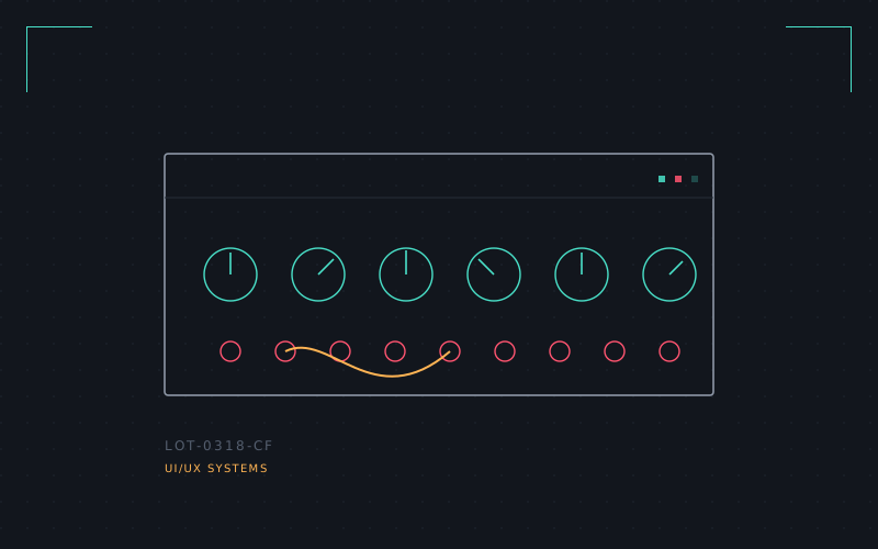
This one started with a Roland manual scanned from 1983 and didn't really stop. Synth panels are UI design with the safety rails off — every knob is a parameter with no menu behind it, every LED is a status readout, and the whole thing has to be legible from across a dark stage.
I got obsessed with the specific grammar of it: brushed aluminum plates, a type style that's always slightly condensed so labels fit next to a jack, red for anything destructive, a certain shade of "institutional teal" that shows up across three unrelated manufacturers like they all agreed on it in a back room in the 1970s.
The concept I built is a software synth interface that refuses to look like software — real panel photography-grade texture, drop shadows that imply actual knob height, a patch-cable system you drag between jacks instead of a dropdown menu. It's slower to use than a modern plugin UI on purpose. Some interfaces should reward patience instead of optimising it away.
No hardware was harmed, no product was shipped, but there's a very satisfying static demo with eleven fake knobs that all turn convincingly.