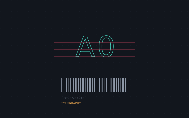
Every typeface decision I normally make is about a human eye: rhythm, contrast, personality. OCR-A and OCR-B threw all of that out forty years ago and I wanted to understand exactly what got kept instead.
Machine-readable type has no use for a serif, no use for humanist warmth, and a strong opinion about ambiguity — a machine reading a "0" needs it to be structurally impossible to confuse with an "O," a "1" with a lowercase "l." Every curve exists to survive being printed badly, scanned at an angle, and read by hardware from 1975.
I drew a full uppercase set plus numerals under those constraints, then broke my own rule by adding just enough personality back in — a single-story "a," a slightly open aperture — to make it usable for human-facing signage too, a typeface that can survive a barcode scanner and a waiting room sign in the same afternoon.
It's currently a 46-glyph proof of concept, not a shipped font file, but it's the closest this list gets to something I'd actually license out.