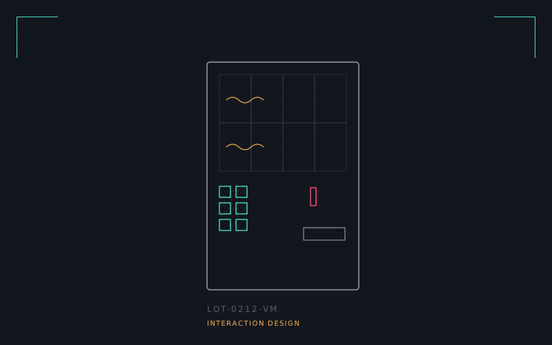
Somewhere around row C4 on a train platform vending machine, I realised the humble coin-and-button interface has better error handling than half the apps I've shipped. Insert wrong coin: rejected, audibly, immediately. Press an empty slot: light doesn't come on, no ambiguity. No spinner. No "something went wrong."
I went looking for as many of these machines as I could photograph — cigarette dispensers, Japanese ticket kiosks, an ancient stamp machine outside a post office — and started cataloguing the physical affordances: raised buttons that click, coin returns you can feel with a finger before you look, backlit product codes that double as a receipt if the thing jams.
The concept that came out of it was a kiosk UI skin for self-service terminals that borrows those tells: a mechanical-feeling click state, a physical-return metaphor for cancelling a transaction, and status communicated through light and sound before it's ever communicated through text. Screens don't have to forget everything hardware already learned.
Prototype lives as a set of Figma components and one working HTML/CSS demo with fake coin sounds, which is admittedly the least serious deliverable in this entire archive.