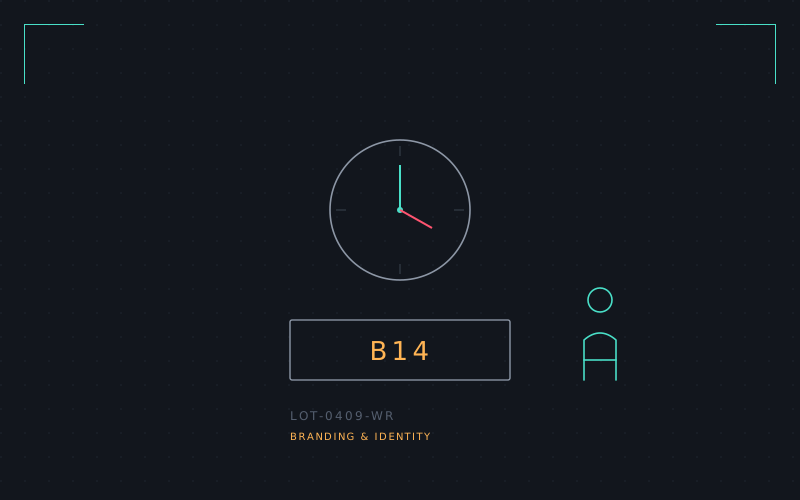
Waiting rooms are a branding problem nobody asks for and everybody sits in. The brief, if you wrote one honestly, would read: reduce anxiety, communicate competence, do not look cheap, do not look expensive, survive being stared at by someone who would rather be anywhere else.
I built out a fictional clinic identity — signage system, wayfinding, a wall clock face, a numbered-ticket display — and tried to design every touchpoint around the idea of "calm technology": information that's available the moment you look for it and invisible the rest of the time. No countdown timers. No red numbers. A queue display that uses tone and letter-spacing instead of urgency cues to tell you where you stand.
The signature piece is a single pictogram system built on rounded, low-contrast strokes — deliberately less alert than standard hospital signage, closer to the visual register of a nice hotel. Whether that's appropriate for an actual clinic is a genuinely open question; as a design exercise in restraint it was one of the more useful hang-ups on this list.
